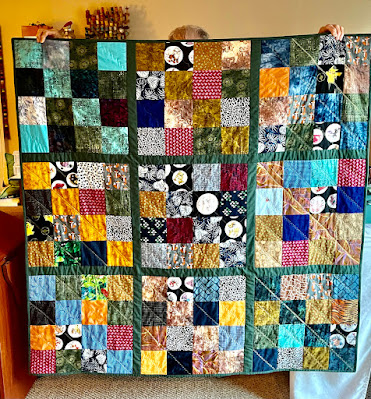
As you can see, I placed a focus fabric square in the middle and then lined the rest of the focus squares side by side, filling in with the four patches.
Pretty purple beach themed focus fabric with coordinating print/solids and then a gingham backing.
After stitching together the provided strips to cut the sections from for the four patches, I saved two sections out and then sewed the top together in columns, placing the two extra sections above and below the center square. The rest were sewn into four patches as the pattern instructs. Since this photo I've got the rows all sewn together. What do you think of my design?


8 comments:
Very cute! I may steal that idea!
Looks great Annie :-)
It's excellent! And it really features the shell print. Great job! Glad you found some time to sew!
Oh YES, I LOVE these colors!!!
Very pretty. That's tough to do, redesign when you only have so much fabric.
Excellent job! Gives more attention to the focus fabric, and is a more interesting design overall!
Pretty cute, Annie! I like the shift in design, not only giving attention to your focal piece, but it made the "checkerboard" a main attraction, that's a nice look!
:-}pokey
The time does fly by! LOL Your layout is very cute. Nice work.
Post a Comment