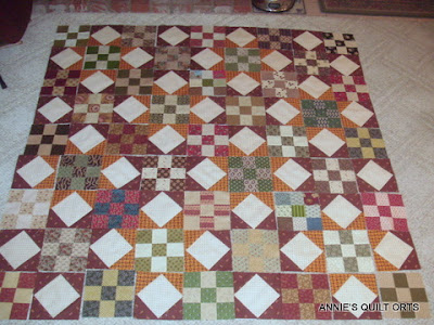
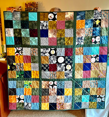
First run: green blocks in the centers of the cheddar stars and all others random. I thought the cinnamon stars got lost in this configuration. Switcheroo, and...
Red blocks in the centers of the cinnamon stars seemed to make them stand out more. Some more Switcheroo took place, but nothing shows like a photo. I can see a few places were there are too many lights or darks but overall I think this works. It is a very busy quilt, no matter what. Opinions on whether the stars seem to stand out enough are appreciated!


13 comments:
I love your quilt, Annie!! So very pretty...busy is good! The stars that are formed are wonderful!
Great quilt Annie! The stars are definitely easier to spot in the second layout.
I agree, the second layout shows the stars more. The stars that stand out the most are the ones with light corners from the nine-patch coming into the red or cheddar ends -- but having some with dark 9-patch corners and some with light just makes it look like the stars are twinkling. :)
Yum! Love the second layout...I say sew it up!
Gorgeous, Annie! Some of my favorite fabrics here! Arranging is always one of the hardest things for me to do! I like your second arrangement, but both are great!
Cheers!
Annie, I think the red centers make the stars more pronounced-great quilt!
Yep- the second layout does show the stars off better. I really like the blocks in this quilt. Start sewing!
I like the second lay out best, and for me it is the one where I see the most stars. It seems the blocks with a "darker light" set of 4 shows up the most. That and where the cheddar and red comes into the triangles.
It's a great quilt, no matter what, but if you want stars, go for stars!! Hugs, Finn
I like the second option best.....i don't know why exactly. It just works well. I'm sure it will be lovely no matter what you choose. Great fabric!
Hmmmm...which do I like best? Okay, I'm just being silly, I agree with everyone else, the stars shine better in the second layout.
Love this quilt Annie. I'm not sure which layout I like best - they are both great in my opinion.
Either combination is beautiful! Your colors are so soft and nice.
I love the second layout better, but they are both great and with such a beautiful quilt you can't go wrong. Isnt it funny how we agonize?
Post a Comment