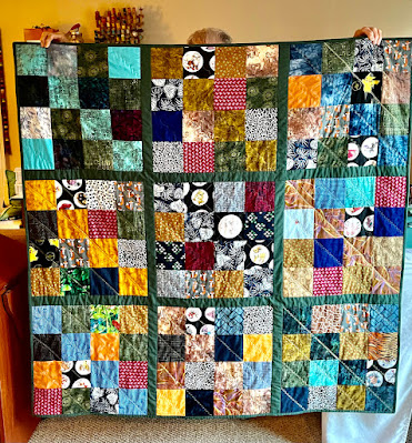
Your eyes do not deceive you, this is the same layout as last week, except the blocks are sewn into their rows. It is almost a top.
The inspiration for this pinwheel quilt came from a free pattern I got in the mail with a subscription request.
I lacked the number of pinwheel blocks for this setting and that's where the half-square triangle idea popped up, followed by wanting to create stripes. I like this quilt pattern with the appliqued leaves and vines and the sawtooth outer border, but will have to do a mock up. I fear the strong colors of the stripes on mine may be too jarring with a white/cream border, even with the vines added. What do you think?
See more design walls on Judy's Patchwork Times.


14 comments:
I don't know, what about pulling out that yellow/gold color in a couple of the pinwheels for the border? Not as stark as the white against your dark colors. Just a thought--I'd have to play with it to see how it looked. Good luck. I'll be curious to see how it all works out.
What about a light blue or light green background for the vine border?
Something light for the border is probably your best bet, Annie. Love the pinwheels.
Hey, strips sewn together is progress! I would have a hard time putting a choice on the border. Keep thinking, you do great stuff ~
:-}pokey
First off, I've been forgetting to tell you I like your carpet!!
Are your going to 'hand applique' or machine the vine on? This is going to be pretty nice when it's finished!
I may agree with Janet, maybe the lighter gold/yellowish would be better than just a white or cream. It would be lighter but be a nice gradual color change from the rest of the quilt!
Happy Monday!
Nice to see the rows becoming a top!
Really pretty. I think light blue or any light colored fabric that you can coordinate with one of your main colors would look great in the border.
I think you can make it work, Annie! It's going to be gorgeous and very rich in color!
Cheers!
I think a grey blue border would be pretty but I think a cream border with the applique would make your pinwheels stand out. Looks great and sometimes using what you have on hand is best!
Wow -- how pretty this is, Annie! I agree that a lighter border might be most suitable. Can't wait to see this as a finish! :)
Almost a top is awesome! It's closer than I am with my unfinished projects at the moment.
I love pinwheels and the HST's compliment them beautifully.
Very pretty. Maybe a light green or blue would be a good border choice for the applique base. Then you could use similar darker colors for the applique that will blend the stronger colors into the border.
I'm glad to see I'm not the only one who makes a quilt from an ad. Been there, done that. Sometimes all we need is a picture for inspiration.
This is going to be a pretty one, and you have some fine suggestions. Looks like a lighter border is in the majority.
I hope your funk stays away, replaced by motivation and confident decision making.
OK, I like jumping in with my opinion....I think the white border is perfect and then use the darker fabric for the outer border and binding. Of course I like contrast. And the white will be well broken up with the vine. You might like to add a couple of flowers using some of the block fabrics, too.
Post a Comment