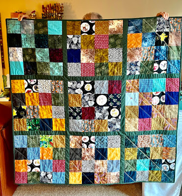
I had to clean my dining room floor in order to do this layout task--are you with me in wondering how one medium-sized dog can generate so much hair? I also found a "love letter" from our little Russian guest, Alica: some drawing in red marker on the floor under the table. It came up with some regular spray cleaner and a bit of scrubbing; I love my new wood laminate floor!
Okay, back to the task at hand, deciding on the final layout of the giant Shoo Fly blocks, with four options:
I won't say yet which I prefer of these options. Left to right, that's 1 and 2 in the top row, 3 and 4 in the bottom row. Opinions wanted, please!


15 comments:
Honestly...I see no major difference in the lay out so it must mean you have a really terrific flow of color. Miss Abby can generate more hair than any two animals combined. I still love her.
I like #2. The contrast between the black and yellow is good, the print and teal coordinate well, and the red and print work well together on the bottom.
I like them all so you're good no matter what - I say. #4 would be my pick if I had to but they all look good.
#1 is number one, then #4.
2 or 1~ I like how the lights are apart in 2. They all look marvelous! Have a happy weekend!
#1 but then they all look great. :-)
Two is my favorite! They all look great though. Isn't it hard to decide? Sometimes placement is such a sticking point for me.
All that hair is just the price you pay for being around a lovable man's-best-friend.
All look fine, but I think #2 separates the lights from the darks best, when you cancel out the color. So which is your fave?
I like #2 best because it separates the yellow/gold and the green which are the two lightest blocks.
You will have as many opinions as you have comments so I'll keep mine to myself :) I'm about to add another furballl to the family, what am I thinking?!
2 the colors/values seem balanced the best
good luck choosing
kathie
I agree with those who like #2 best. It is the only one that doesn't have the light blocks next to each other - ;))
I like all of the layouts . I dont think you can go wrong no matter how you choose to sew it all up!
I like #2 Annie, but i would pick whichever pleases your eye the most!
Cheers!
I like number 2 best (Really. it has nothing to do with the fact I know which version you picked!).
Post a Comment