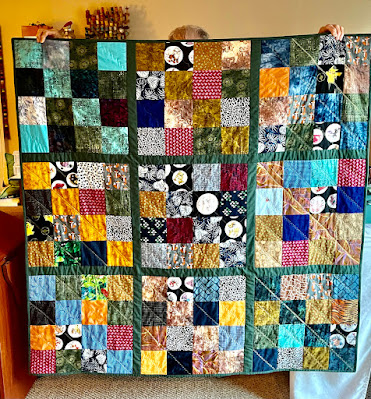
Yesterday the sections were cut from the strip sets.
Here laid out according to the pattern and my original vision of my fabric choices versus the magazine.
I was bothered by the high contrast between the rust stripe and the green--those complementary shades intensify each other--and the dark appearing too deep with the rust stripe around it.
Second layout.
The neutrals seem more balanced in this layout with the tan and rust more prominent, which is what I want. Opinions?


13 comments:
#2, hands down. Good eye, you!
I agree with Mrs. Goodneedle -- second layout is yummy! That's a really cool pattern.
Unamious - #2 is right on. Judy C in NC sends her warmest (literally) wishes
Unanimous - would have been a better way to have spelled it - don't cha think!!! This darn computer can't spell. JCnNC
I like the second layout better too.. I think you're completely right about it being a better balance.
It's going to be GORGEOUS......
You have a great designing eye. #2 for sure although you know… I rarely offer up my opinion because I'm shy. Hee.
The second layout looks good. I'd go with your first instict.
I agree with all the other voters, although it would be difficult to describe why.
Looking good Annie......i love the colours....I am sure whatever layout you choose will work!
I agree too.I think that's everyone in agreement. It's going to look fabulous.
Another voice following along with the quiet mob --I agree that #2 is the better layout choice.
Your next profession, possibly quilt designing? You have an eye for it.
#2 pops right out at me, Annie! Looks like I'm right along with with everyone else!
Cheers!
I like your work it is beautiful.
Thank you for to share.
I congratulate
good bye Josefina
tijertasycuchara.wordpress.com
Post a Comment