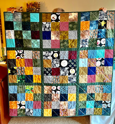
The pattern designer, Heather Mulder Peterson, always uses striped bindings on the bias.
I have these two green stripes, but am leaning toward pink to continue my pink and blue theme.
It's always so great to have choices! This pink print is my favorite so far.
This deep pink dot is reading more red but really is a lovely lipstick shade. Opinions, anyone?
Also in progress, the remaining squares from the Boutique by Chez Moi charm pack are turning into the "Party Time Runner" pictured on the back of the On the Run pattern book, and some scraps are being turned into the "Baby Boxes" tablerunner, also pictured. The latter will be used as my first leader/ender project once I get the white pieces cut for the box centers. It has been really fun playing with these squares and strips in lovely summer colors.


12 comments:
They look great! I have that book, but haven't been near as ambitious as you. :-) I don't have an opinion on which binding to choose as I like all of them. Its funny how which ever color you put makes that color more prominent in your runner; so go with which color you want people to 'see' first. ;-) Have a happy day!
yep! Works in Progress DO sound better than Unfinished projects. The way I sort my STACKS of started projects is:
1)if I "see" them as unfinished...they get donated for someone else to finish
2)if I "see" them as "in progress"...I keep them to work on at a later date.
Great pictures, pretty colors!
hugZ,
annie
rubyslipperz106.blogspot.com
I like the darker pink dot fabric best. Looks like it would go well with the yellow and green fabrics with the floral design (I have some of that fabric in blue and LOVE it). Very pretty design.
I love your works in progress.....and yes, it does sound better than UFO
What a pretty tablerunner - I like the first pink binding that you showed - picks up the colors of the Chez Moi Boutique fabric which was one of my favorite Moda collections - wish I had bought lots more! Happy stitching-
I like the light green and white stripe for the binding...
I always loved the Noutique line but could never quite work out what I wanted to do with it - so it remains on my "perhaps one day I'll buy that " list.
The table runner looks terrific by the way. Hope you're enjoying your week.
Beautiful table runners. The ligher pink is my favorite.
I'm with you, Annie - the pink print is perfect! UFO? What's that you say? LOLOL Hey - how about Ultra Fantastic Ort!!!
Cheers!
Even though I'm a big fan of stripes on the bias for binding, I think your first pink is the winner.
I love stripes for binding, but for your table runner I agree with you, the lighter pink print makes all of the colors in the center pop out more. Very cute.
The table runner is beautiful. I think I like either one of the greens better. Of course, you have to use whatever makes you happy. I know the end product will be perfect!
CUTE...CUTE....CUTE.....CUTE!!! Ok, did I say it was CUTE!
Post a Comment